Architecturally-designed homes in the southern hemisphere are typically oriented so that the rear rooms — usually the main living spaces — receive optimum natural light.
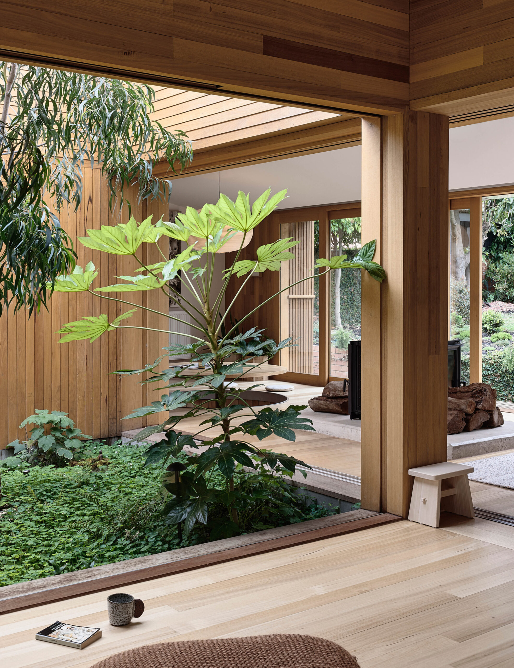
Park Street by Michael Ong Design Office (MODO) takes a more comprehensive approach that ensures connections to natural light and nature throughout the entire home via a transformative internal courtyard.
This project was inspired by the client’s desire to champion what they value most: people in their home, conversations, nature, and the promotion of curiosity and contemplation. In other words, priceless memories and intangible experiences.
They likened their ideal home to an elevated campsite — a place that encourages more time spent outdoors than in, and precious moments engaging with others.
‘A home that provides just enough shelter for just those times where living, working, and playing outside isn’t possible,’ reads the client’s brief. ‘Like a permanent (or semi-permanent) tent, or series of tents, rather than a castle or the destination of itself.
‘Bedrooms should only be slept in ‘when the sun has gone down and the campfire banter has subsided, and only because it might rain and there are mosquitos.’
The clients told Michael, think of the house as the parents of a grown-up child. ‘They can provide shelter if they need to, but otherwise encourage independence and a life away from them.’
MODO completely reimagined the post-war brick veneer home, which was previously staggered into three loosely-defined tiers towards the back of the block.
The architects essentially removed the middle volume (previously host to a second living area and bedroom), making way for an internal courtyard and new living area to the east.
Much of the remaining floor plan was reconfigured within the existing envelope, alongside a new floor hosting an additional bedroom, bathroom, and study.
The new upper storey is timber-clad, creating a deliberate and distinct visual separation between the original brick home and the addition.
Michael credits the courtyard designed by Straw Brothers as arguably the most successful element of the project.
This outdoor space features few plant species, allowing an Acacia implexa (lightwood) tree and Fatsia japonica (Japanese aralia) to overtake the garden, with Viola hederacea (native violets) running rampant underneath.
It sits in contrast to the front and back yards — which are relatively steep and almost entirely lawned — to become the most accessible and interactive outdoor area on the property.
Frequent engagement with the outdoors is required in order to reach the upstairs addition, which is only accessible via the courtyard’s open-air spiral staircase.
Views to nature are the central focus of the home, while the architecture itself recedes into the landscape — just as the clients requested.
‘It’s a reminder that the most captivating spaces in a home aren’t always enclosed by four walls, a floor, and a roof,’ says Michael.

