Any time a design professional gets to flex their skills in a renovation of their own family home, the project becomes a true labour of love.
This was the case for Sarah Kennedy — principal designer of Melbourne-based interior architecture studio Edward St — who recently transformed her Elsternwick cottage she shares with her husband Alex and their two children, Jack and Issy.
‘We lived in the existing worker’s cottage for 10 years before embarking on the build, newborn Issy in tow,’ Sarah says.
The house was one in a row of identical Edwardian cottages, and unlike its weatherboard neighbours, their property had been unsympathetically covered in brick and renovated over the years. It felt like a bit of a pick-and-mix of varying architectural eras, and the single-level floor plan needed an extension to accommodate their growing family.
‘We wanted to celebrate the home’s evolution over the last 120 years,’ Sarah says. ‘We didn’t have the budget to be particularly experimental, so we had to be clever about what to focus our attention on.’
They decided to keep the brick, rendering it a contemporary cream hue, setting the tone for their aesthetic vision of a house that was ‘warm, inviting, and unexpected, rather than flashy’.
This also meant finding a way to expand the footprint, while ensuring the cottage still looked in proportion on the street. A new timber-clad upper level blends in with the brick facade, allowing them to increase the home’s footprint to 195-square-metres and retain the dimensions of their large courtyard.
Sarah says both budget and authenticity were key in informing the material selections and spatial design. ‘We decided having four generous bedrooms was more important than a stand-alone laundry or butler’s pantry, for example,’ she explains.
‘We also avoided timber-look and stone-look products and utilised the real thing for small but impactful moments.’
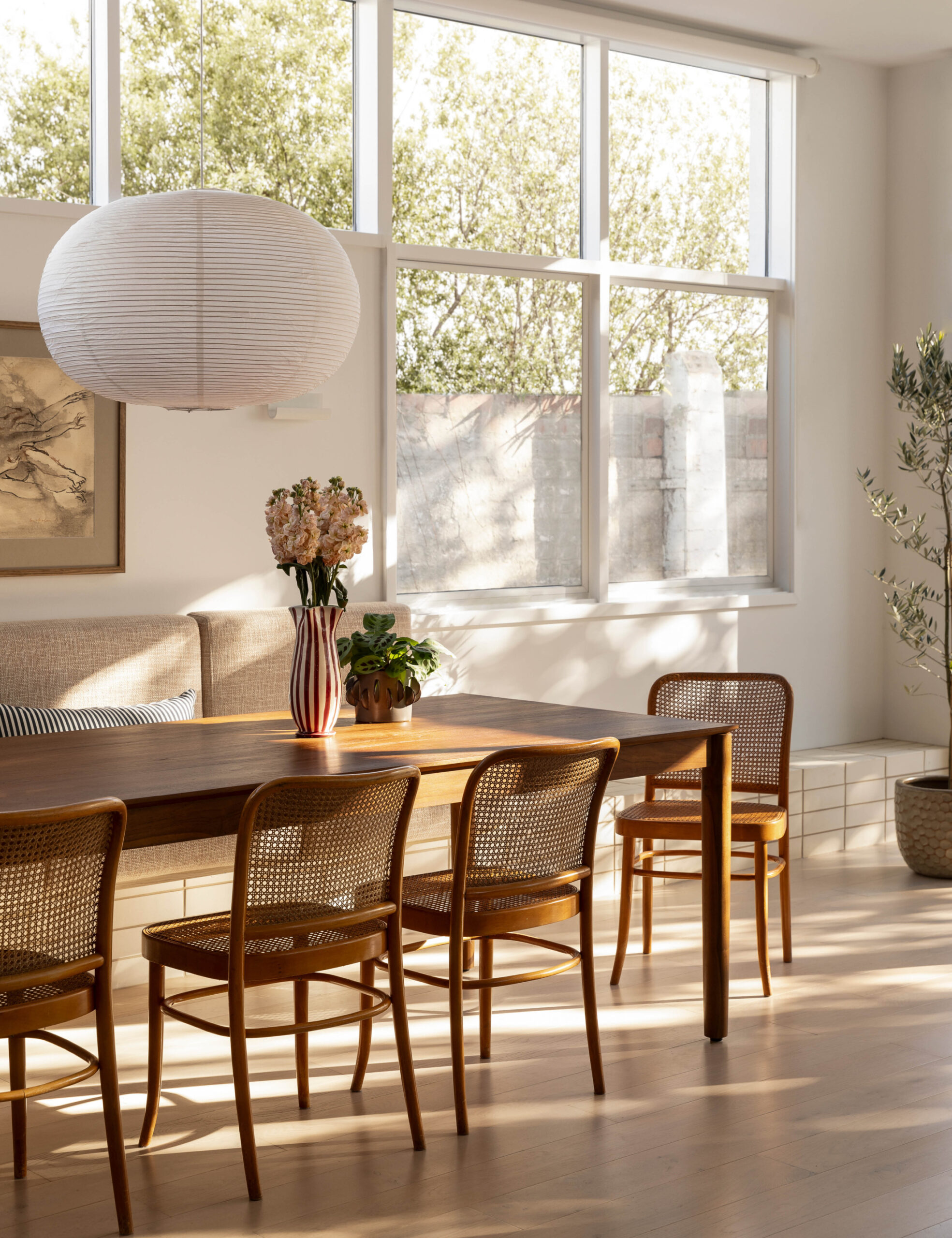
Inside, the renovation paid homage to its Edwardian origins with panelling and dado rails in the hallway, as well as embracing its mid-century alternations through duck-egg blue finger tiles, blue laminate and expansive windows in the open-plan kitchen, dining, living area — which Sarah calls the ‘great room’.
Freshness came through the light base, featuring oatmeal carpet, limed timber flooring and cream brick. But Sarah says the hallway is an underrated hero of the home.
‘I love how the light from the high-level windows floods down through the battens to cast shadows below,’ she adds. ‘I wanted it to feel Edwardian leaning contemporary and I think we achieved that.’

